43221 Queen Elizabeth Sixth Form College

.

Monday, 18 March 2013

Weekly Production Monitor 18th-24th March

Third Week Of Production -

In the second week of production I had managed to finish my magazine front cover. I finished it to a high standard and could see no visible faults therefore I am going to return to it after I have finished my double page spread to correct anything or add more drop shadows etc.

My target for the third week of production is to re-draft my article and check for any mistakes and read it to ensure it includes everything I want it to and so that it has a moral and will be understood by the target audience. My other targets for this week are to create the in-design spread and to add a title and the main image onto it so that can be a starting point for uploading my article and other pieces of text and imagery. The main problems I think I will face will be choosing the design and place for the title and ensuring the title and the main image fits nicely onto the page. There will be many skills I will learn throughout this week as this is the second time I have used inDesign therefore I will be watching tutorials as to how to do things such as make text flow.

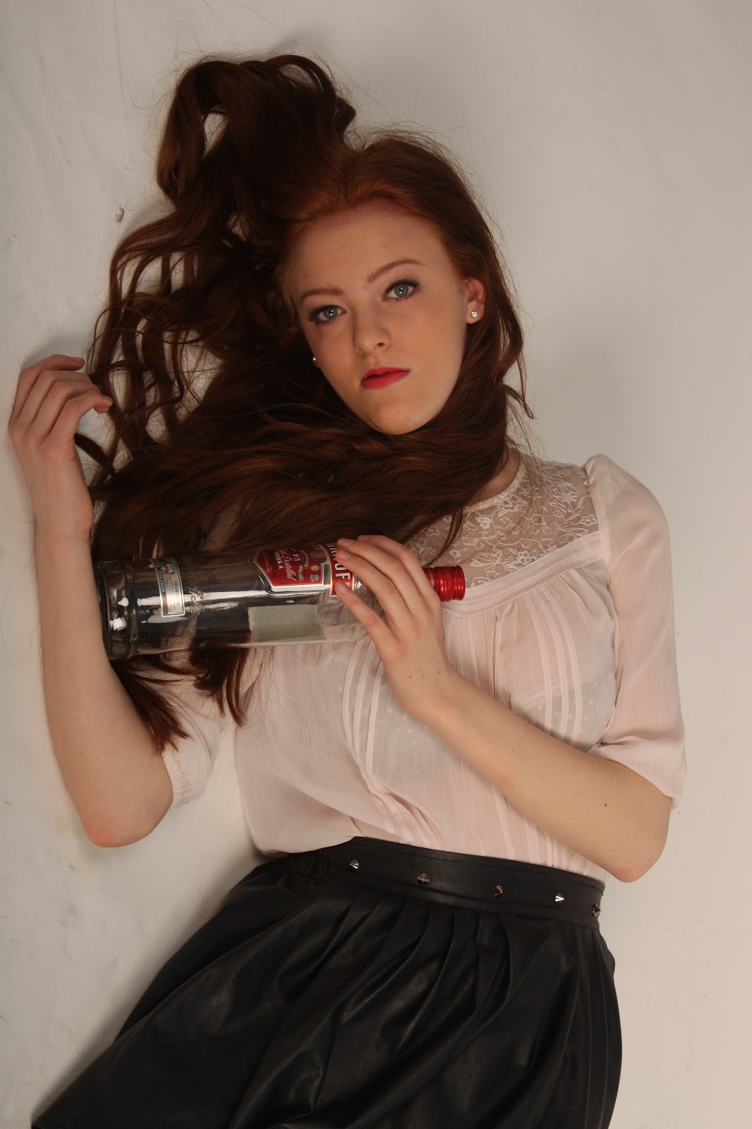
At the beginning of the week I started to create different titles and re-arrange them on the page around the main image. I put individual words into a red box which fits in with my colour scheme, I changed the angles of each of the boxes so that they looked scattered across the page almost like an annonymous death letter with magazine letters and words cuttings.  After I had the title and main picture present on the page it was easier to then add the rest of the text and imagery onto the pages.

This is my magazine at the beginning of production with the title and main image situated on the page.


 This is my double page spread the next day when I have added a sub heading and the main body of my article. I found that I had a lot of space left for an extra column therefore I added a fact box to fill the last column space as it will attract immediate attenion and will shock the target audience.


Weekly Production Monitor 11th-17th March

Second Week Of Production -

In the first week of production I completed the editing of my photographs and began to make my front cover. I used new skills on photoshop such as magnetic lasso tool, sponge tool and I used new filters. I had upoaded the photograph which looked most professional and I placed it onto a photoshop document which would be my front cover, then I added my main sell lines to create the main layout which I could follow from to add my other sell lines. I had successfully adapted the four main sell lines onto the page and positioned them correctly and how I wanted them to be on the page so that I could then add to it and build from the basic shape. The problems I had were trying to place all of the sell lines onto the page in a professional layout however after changing the layout multiple times I finally started to get the look I was after.

This week I will be looking to finish my front cover to ensure I can finish the double page spread in time and also to a professional standard and have time to do any corrections and annotations. I am going to start by building up sell line by sell line and ensuring they are all positioned on the page in an appropriate layout. I will document what I wish my sell lines to say so that I can keep on track f what sell lines I need to upload to the front cover and the size of the different sell lines so that I can lay them out in the right place on the cover. I think the main problem I will have will be getting all of the sell lines on the page so that they all contrast each other and fit correctly.

Throughout this week, I created my final front cover, however once I had analysed it I realised that there was a large space missing on the page which made the cover look bare, therefore I needed to add in another sell line above the main sell line 'how a girl killed her bestfriend'. To find an appropriate sell line I researched other teenage magazine covers to find out the types of sell lines they include and how many lines they average to take up. I decided to include a short sell line which could take up several lines. This would fill he gap nicely and would not be too bulky for the space needing to be filled. After I had included this sell line I found that my magazine cover was a strong piece therefore decided to leave it and move on and come back to it later to give it the final touches and try to spot any faults. I also added finishing touches such as adding a drop shadow onto my main sell lines to ensure they stood out on the page and caught peoples immediate attention.

Monday, 11 March 2013

Weekly Production Monitor 4th-10th March


 First Week Of Production -

This week my target is to have taken and edited the photographs I will be using throughout my magazine and start my magazine cover by putting on the main sell lines. I am hoping this will not go wrong however if the photographs do not look professional I will start again and watch other tutorials or I will choose another image to use. I will be watching multiple tutorials found on moodle and the internet to develop my skills on photoshop to create professional images therefore I will be learning a number of new skills.

At the beginning of the week I started to edit the photographs from my photoshoot to create the effect I wanted. I first of all created the first image where the model looks bruised however it did not look as professional as hoped so I decided not to use it on my front cover. I used the sponge tool and the paintbrush tool to edit this photograph to make bruises using the desaturation then adding purples and yellow tones to try to create realistic bruises. I then created the second image which I found to be successful therefore I will be using this for my front cover.

By the end of this week, I had started to create my front cover. I have uploaded the main image I will use and placed my main sell lines onto the page to see the effect they gave and where abouts they need to be positioned. I had entered a breakout box which was a circle at the bottom of the page with another image from my photoshoot inside with a sell line attatched, however it did not fit in with the layout and looked out of shape therefore I decided to delete it and not use it. I then replaced it with a different sell line which fit in way better and created the professional look I am after.